Redesigning Brand Identity for an non-profit organization foundation representing the foundation for the past 10 years, additionally also updating brochures as per current branding.
Client
SCSD Educational Foundation
Role
Logo Design
Editorial Design
Branding
Tools
Adobe Illustrator
Adobe Indesign
Adobe Photoshop


Overview
Creative Brief
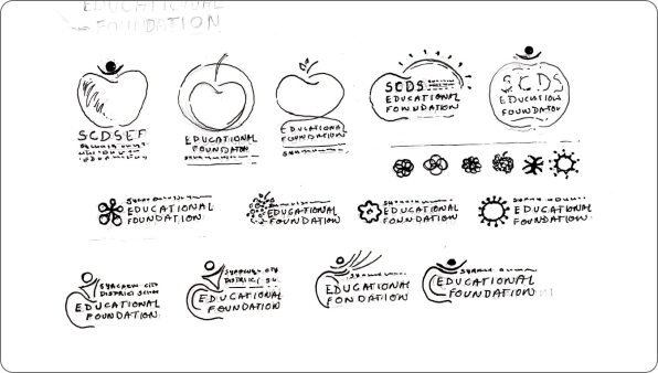
To redesign the logo for Syracuse City District School Education Foundation that has been representing the foundation for the past 10 years. The non- profit organizations would like to have a new logo that represents and reflect their community.
The earlier logo is perceived outdated as per the given brief, therefore a new and fresh identity is demanded. A logo that can be easy to use and can represent the education foundation better. The logo will also be further utilized for creating branding elements, that can be used correctly and consistently for all visual design requirements of the organization.
Target Audience
Key Target Audience: SCDS Community - Faculty, Students, Staff and Alumni.
Secondary Audience: Private Donors, Corporate and Community Cponsors, District Families and Friends of Foundation and Residents of the City.
Guiding Principles of the Organizationing
Mission: To supplement, support and enrich the student experience to prepare them for a successful future.
Value Proposition: To provide teachers with enhanced resources and community linkages to create equity and excellence in education for their students.
Core Competencies: Fund development - consciousness raising - fund management and distribution.
Vision: A community of students, families, neighborhoods, institutions and businesses made stronger through the achievement of excellence in public education.
Current Logo
Lorem ipsum dolor sit amet, consectetur adipiscing elit. Suspendisse varius enim in eros elementum tristique. Duis cursus, mi quis viverra ornare, eros dolor interdum nulla, ut commodo diam libero vitae erat. Aenean faucibus nibh et justo cursus id rutrum lorem imperdiet. Nunc ut sem vitae risus tristique posuere.


Visual Design Concept
Education | Growth | Strength | Vibrancy
This newly designed logo helps me bring the liveliness to the logo, give the older logo a fresh new look, and along with this lets the audience or people associated with organization relate the logo to its previously used identity.
The logo here, represents a community and support group that works within a society to help it grow and achieve new standards - by the use of elements like circles, layers to the circle and leaves.
Brochure Design


